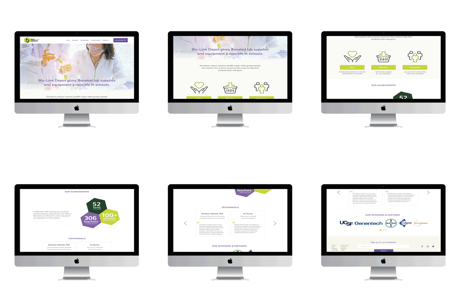
Biolink is a nonprofit organization that donates laboratory supplies and equipment to teachers and students in the Bay Area.
Biolink website requires clear communication and streamlined processes to ensure that donors understand how to contribute and recipients can access the resources they need.
Here is how we simplify donation!

The Solution
15%
Increase traffic by 15% in the donation page.
Increase donation by providing an intuitive navigation.
45%
Intuitive giving page by adding and updated laboratory supplies updates
Brief
🔎 Research Categories: Evaluative and comparative.
📝 Project Type: Field study
🕵️♀️ Role/Contribution: Research Lead, UX Strategist
🗓️ Timeline: 4 months
🛠️ Relevant Tools: Zoom, Monkey survey
🤝 Cross-Functional Team: UX Researcher and Marketing Designer
👥 Stakeholder Teams: UX, Product, Product Marketing.
Problem Statement
Users can not find access to information about donations on the website.
Assess is confuse and not effective on the website donation.
simplify forms for students in a few steps.
Research Goals
Investigate and analyze user preferences regarding about donations.
Analyze students preferences how they getting the right equipment.
Understand whether the pick up system for donations provided in the website is accurately and communicates the steps to users.
Learn how users prefer to navigate to the donation forms track the time the donor take to fill the form and summited.
Methodology
Heuristics
Field Study
Competition Analisys
Survey
Artifacts
Persona donor

Persona giver

Site Map

Current site
New Site Map

The Challenge
Change Mind set!
Changed the logistic improving flows and steps was challenge for us a designer
since Biolink team used to follow the same steps for years, it was hard for them to change for a better outcomes.
The education and guidance was important for the team!
Part of our work was guide Biolink and proof that the changes we accomplish will simplify their work.
Simplifying the steps for donors to provide surplus equipment while ensuring recipients can efficiently select items from inventories is crucial.
this includes understanding and follow the same flow to collect right equipment.
knowledge about users needs.
What I learned
Insights
● The Opportunity of evaluated the logistic of the pick up, finding frictions since the moment the donor try to set a pick up
● No clarification about demanding items, size of the lab instruments and status of the supplies.
( missing pieces, damaged old supplies) .
● During this process there clearly was an inventory issue, since the website did not show the demanding supplies they need to be donated.
● For Biolink will be difficult to repair expensive Items or received items don't need it such as chairs or liquids.
● Companies couldn’t select the correct truck size, detailing the item value, older or new or submit a request form with questions.
● Most boxes were already sealed upon arrival. Thus, Biolink couldn’t assess the quality of the donations for sizes, damages, or even possible rejection.
● The friction is miscommunication between the product description base in the criteria.
What we did with the insights?
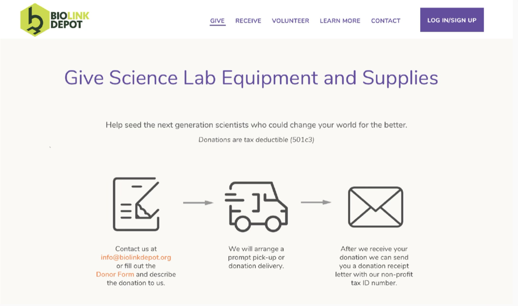
Give page
Designing intuitive navigation, inventory browsing categories for pick up donation schedule and donation submissions.

Donations Pick up
Designing intuitive navigation, inventory browsing categories for pick up donation schedule and donation submissions.


What we achieved
Optimizing digital tools for donation and inventory management.
Improve satisfaction among donors and recipients, boosting participation rates.
Streamlined workflows reducing operational costs and time spent on coordination, benefiting both the nonprofit’s mission and its stakeholders.
